Project reference / published Suntronix record
Visibility goal
Ranch Plaza Dental Group needed a clean, dimensional storefront identity that could remain legible across a busy commercial setting. The sign had to carry a long practice name, preserve the dental graphic, and feel proportionate to the available facade rather than looking compressed or added as an afterthought.
Sign approach
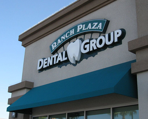
Individually formed channel letters translate the practice name into a building-mounted sign with depth, contrast, and separation between the words. The white letter faces stand away from the wall, while the green Ranch Plaza panel and tooth symbol create recognizable visual anchors.
The finished composition uses multiple levels of emphasis. “Dental Group” carries the primary reading weight, while the upper panel and icon support recognition without forcing every element to compete at the same size.
Design decisions
A channel-letter layout must balance brand artwork with the actual storefront. Letter height, stroke width, spacing, logo scale, capitalization, mounting area, and viewing distance all affect whether the name can be understood from the parking lot and customer approach.
Production and installation planning
Before fabrication, the team considers wall construction, available attachment points, electrical access, raceway or direct-mount requirements, landlord criteria, local permitting, working height, and installer equipment. Accurate field dimensions and clean vector artwork help keep the production layout aligned with the approved concept.
What this project illustrates
Dimensional letters can give a professional practice a strong storefront identity without relying on a large cabinet. The success of the format comes from disciplined spacing, a clear hierarchy, and a mounting plan developed for the building—not from adding unnecessary visual effects.