About this project
The project
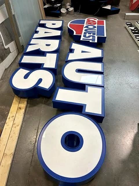
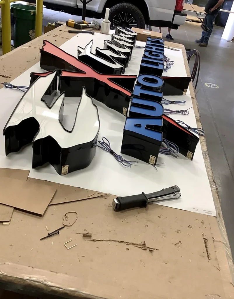
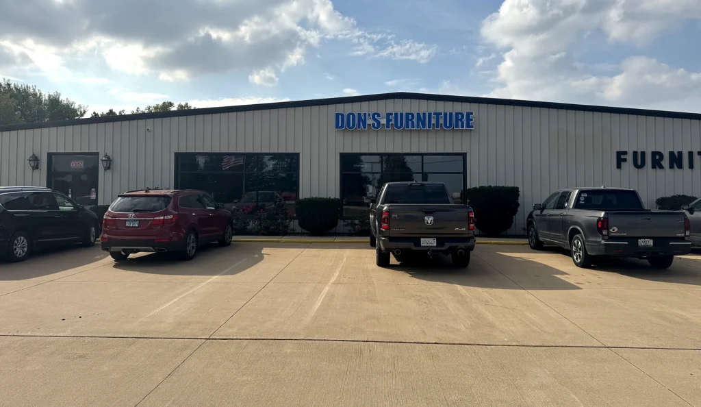
Don’s Furniture uses dimensional channel letters to give the storefront a clear, recognizable face from the customer approach. The project is a useful reference for businesses that need building-mounted identity to feel connected to the scale and architecture of the facade.
What the field image shows
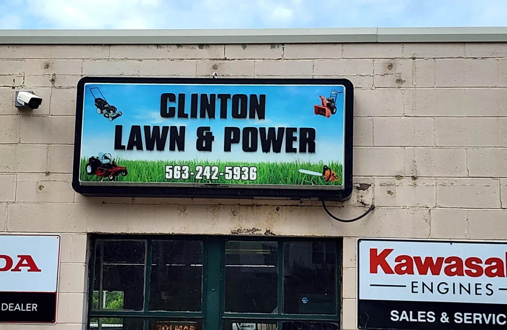
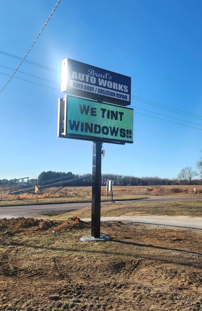
The finished letters create a long horizontal read across the building face. The business name has room to stay legible without treating every architectural detail as sign copy, while the dimensional format separates the identity from a flat printed panel.
How this format supports the site
Channel letters can give a storefront permanent identity when the building itself is the main customer destination. Letter height, stroke width, spacing, contrast, and illumination should be tested against the actual parking-lot and roadside views rather than a close-up artwork proof.
What needs to be planned
A similar project begins with the sign band, wall construction, mounting area, electrical access, working height, landlord requirements, local rules, and installer access. Those conditions help determine the mounting method and the information required before the letters move into production.
Use this project as a reference
Bring wide photos of the building, approximate wall dimensions, logo files, and the distance customers first see the name. That gives the first sign conversation enough context to compare channel letters with other building-identification options.