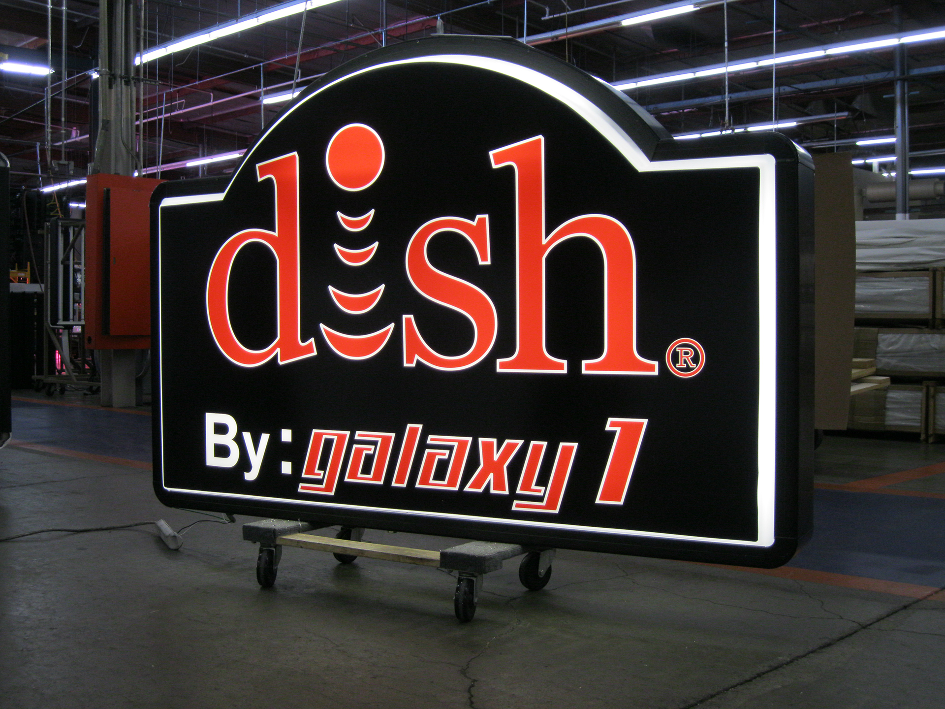
Project reference / published Suntronix record
Visibility goal
The project called for illuminated brand identification that would remain recognizable after dark and read cleanly from the customer approach. A familiar national mark leaves little room for improvisation: the proportions, spacing, color relationships, and nighttime appearance all need to preserve the identity people already know.
Sign approach
Individually formed, internally illuminated letters reproduce the DISH name as a dimensional sign rather than a flat printed panel. The separated letterforms create a crisp building-mounted presentation, while internal lighting keeps the wordmark visible when surrounding light levels fall.
The photograph also illustrates why negative space matters. Open areas inside and around the letters help the logo hold its shape from farther away instead of becoming one bright block.
Production considerations
Branded channel-letter work starts with usable artwork and an agreed mounting layout. Letter construction, face and return colors, illumination, power supplies, wiring paths, service access, and attachment points must be coordinated before fabrication. The wall material and available mounting area affect whether letters are mounted directly or carried on another support system.
Installation planning
A complete site review should document wall construction, electrical access, working height, equipment access, landlord criteria, local sign rules, and the safest installation sequence. Those details influence both the sign design and the information supplied to the installer.
What this project illustrates
Strong branded signage is not only a matter of making a logo larger. It requires disciplined translation from artwork into a buildable, serviceable sign that retains its identity during the day and after dark.