Project reference / published Suntronix record
Visibility goal
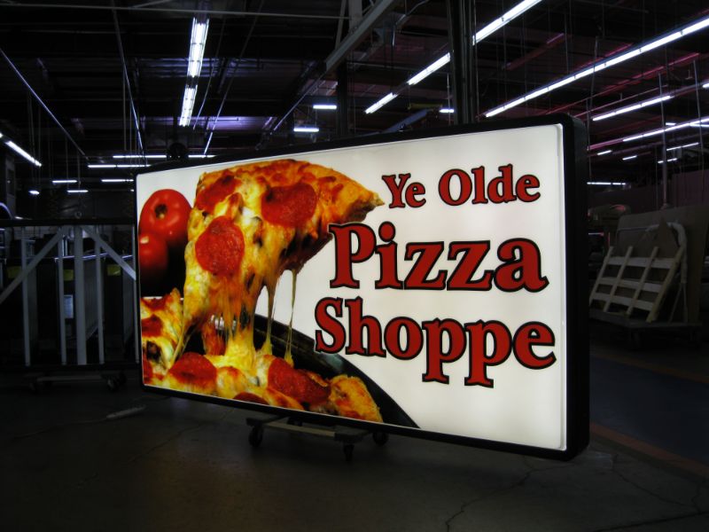
A restaurant sign often has only a few seconds to communicate both a business identity and a familiar category. This custom piece uses pizza-specific imagery to create recognition before every word can be read, helping the sign function as a local landmark rather than a generic name panel.
Sign approach
Custom fabrication combines the business name with category artwork in one shaped composition. The illustrated pizza form provides an immediate visual cue, while the lettering gives customers the specific identity to remember and search for later.
Shape can be a useful differentiator when it remains simple enough to understand from the customer approach. The silhouette, major color blocks, and main copy need to hold together at distance; small decorative details should remain secondary.
Design and production planning
The process begins with clean artwork and a decision about which parts of the identity need dimensional fabrication, illumination, printed graphics, or applied color. Scale, face materials, internal structure, lighting, service access, and weather exposure are considered together.
Site and installation planning
Available sign area, existing supports, property sight lines, local sign rules, wind exposure, electrical service, equipment access, and mounting responsibilities influence the build. A shaped sign may also require different structural thinking than a standard rectangular cabinet.
What this project illustrates
Category imagery can make restaurant signage easier to recognize when it supports—not replaces—the business name. A successful custom shape still depends on legible copy, strong contrast, and a practical production and installation plan.